 Semantic portal
Styling
How do I style my components?
In React Native, inline styling and stylesheets.create are used to style components.
// React Native
<View style={styles.container}>
  <Text style={{ fontSize: 32, color: 'cyan', fontWeight: '600' }}>
    This is a sample text
  </Text>
</View>

const styles = StyleSheet.create({
  container: {
    flex: 1,
    backgroundColor: '#fff',
    alignItems: 'center',
    justifyContent: 'center'
  }
});
In Flutter, a Text widget can take a TextStyle class for its style property. If you want to use the same text style in multiple places, you can create a TextStyle class and use it for multiple Text widgets.
// Flutter
var textStyle = TextStyle(fontSize: 32.0, color: Colors.cyan, fontWeight:
   FontWeight.w600);
	...
Center(
  child: Column(
    children: <Widget>[
      Text(
        'Sample text',
        style: textStyle,
      ),
      Padding(
        padding: EdgeInsets.all(20.0),
        child: Icon(Icons.lightbulb_outline,
          size: 48.0, color: Colors.redAccent)
      ),
    ],
  ),
)
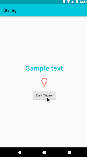
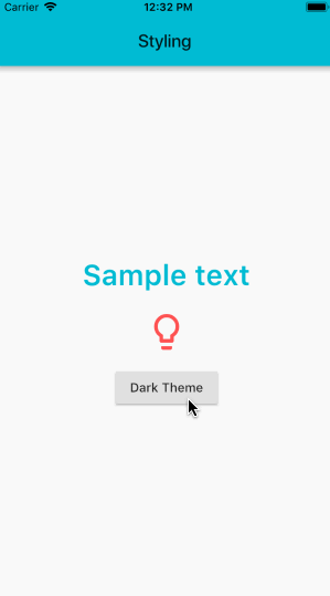
|
Android |
IOS |
How do I use Icons and Colors?
React Native doesn’t include support for icons so third party libraries are used.
In Flutter, importing the Material library also pulls in the rich set of Material icons and colors.
Icon(Icons.lightbulb_outline, color: Colors.redAccent)
When using the Icons class, make sure to set uses-material-design: true in the project’s pubspec.yaml file. This ensures that the MaterialIcons font, which displays the icons, is included in your app.
name: my_awesome_application
flutter: uses-material-design: true
Flutter’s Cupertino (iOS-style) package provides high fidelity widgets for the current iOS design language. To use the CupertinoIcons font, add a dependency for cupertino_icons in your project’s pubspec.yaml file.
name: my_awesome_application
dependencies:
  cupertino_icons: ^0.1.0
To globally customize the colors and styles of components, use ThemeData to specify default colors for various aspects of the theme. Set the theme property in MaterialApp to the ThemeData object. The Colors class provides colors from the Material Design color palette.
The following example sets the primary swatch to blue and the text selection to red.
class SampleApp extends StatelessWidget {
  @override
  Widget build(BuildContext context) {
    return MaterialApp(
      title: 'Sample App',
      theme: ThemeData(
        primarySwatch: Colors.blue,
        textSelectionColor: Colors.red
      ),
      home: SampleAppPage(),
    );
  }
}
How do I add style themes?
In React Native, common themes are defined for components in stylesheets and then used in components.
In Flutter, create uniform styling for almost everything by defining the styling in the ThemeData class and passing it to the theme property in the MaterialApp widget.
  @override
  Widget build(BuildContext context) {
    return MaterialApp(
      theme: ThemeData(
        primaryColor: Colors.cyan,
        brightness: Brightness.dark,
      ),
      home: StylingPage(),
    );
  }
A Theme can be applied even without using the MaterialApp widget. The Theme widget takes a ThemeData in its data parameter and applies the ThemeData to all of its children widgets.
 @override
  Widget build(BuildContext context) {
    return Theme(
      data: ThemeData(
        primaryColor: Colors.cyan,
        brightness: brightness,
      ),
      child: Scaffold(
         backgroundColor: Theme.of(context).primaryColor,
              ...
              ...
      ),
    );
  }